Thursday, December 11, 2014
Holiday Hen Card
I wanted to end this class the way I started: with chickens.
This card was fairly simple, but what sets it apart from my other works is that I experimented with fabric cutting to get that holiday sweater look. I learned that different fabrics are easier to cut than others, and that I should maybe have looked at some iron-on fabrics for this project, but I still feel they turned out OK.
Shout out to my grandmother for graciously donating her seasonal fabric!
Also, chicken sweaters do exist!
Media Sampler
Phew, this was one heck of a project! I obviously learned a lot from it, I especially learned that the little details are what really sell your piece, and that I should spend more time on the cleanup of my pieces.
I also learned that acrylic can be VERY difficult to get consistent solid colors and even harder to erase mistakes.
I also learned that if you do your under sketch in blue, do NOT start off with a blue wash as your first coat of paint, use a red under sketch instead.
Friday, October 31, 2014
Fairy Tale Project: SEALS
After looking at these concept sketches copared to the one I have in the final drawin, I think I might go with the bottom ones. I feel like I spent so much time trying to get the seal to wrap around the fish that I lost a lot of that movement and "hugry-ness" of the seal. I will let you be the judge.
Thursday, October 30, 2014
Friday, October 24, 2014
Friday, September 26, 2014
Thursday, September 18, 2014
Acrylic Study
Small transparent acrylic study of a tree:
What I learned: I'm a little rusy with acrylics, especially using them transparently, so It was a lot of re-learning. Luckily I picked it up pretty quick.
What I did learn is that I'm still too timid when it comes to painting transparently, tending to playing it safe with lighter tones instead of darker tones. As a result I feel my painting looks washed out and lacks the rich colors of the sunset I was trying to paint.
I'm also trying to gauge how quickly acrylic dries as opposed to water color, as the two times seem to vary quite a bit, so it's hard to tell when I should be adding more paint to get a more blended or cell-shaded look.
What I did learn, or rather re-learn, is that acrylic, even in it's transparent form, blends better than water color, so you can get some nice gradient effects easier than if you tried to replicate them in water color.
Another thing I learned while drawing was that I was having trouble deciding to go with a more cartoony cell shade look for the tree or a more realistic one, and i feel my inability to choose one left the tree looking a bit...bleh...i might go back to retouch it.
Thursday, September 11, 2014
Thursday, September 4, 2014
What I learned: A LOT. I'm quickly learning that things that are fairly simple are pretty hard to draw when you have to draw them from different angles. I started out drawing some of the hibiscus around campus, it was easy to determine the basic conical shape of the flower, but learnign how the petals fold and curl around the top of the flower were really tricky to pin down and I still need some practice!
I then tried simpler flowers such as Buttercups, poppies and daisies. I learned that these flowers had a bowl-shape to them, and others were straight elipses, but still had depth to them. While they were easier than the hibiscus, it still proved pretty challenging trying to nail down how the petals curl around into a bowl shape and how each petal forshortens with perspective, luckily I think I nailed down those types of flowers pretty well.
Tuesday, September 2, 2014
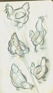
Chicken Studies
Done from my very own chickens at home!
What I Learned: Boy, for someone who owns chickens, they are pretty challenging to draw. But I think I was able to simplify their body shapes and proportions by using a skewed cylinder for the torso,learning how to simplify the tail fluffs, and where to place the legs so the chicken doesn't look like it's about to topple over when I draw her.
Subscribe to:
Posts (Atom)


